CONCEPT WORK
Not every great idea starts with a client. Some of my favorite designs come from pure creativity—projects I take on just for fun, to explore new styles, try out ideas, and refine my craft without any constraints. These concept projects aren’t tied to real companies or paid work, but they showcase the type of design I love to create and the level of quality I bring to every project.
Roam & Relic is a bold, color-forward gift shop built around art, nature, and independent makers. The space is vibrant and graphic — walls layered with prints, illustrated goods, handmade objects, and small-batch pieces that feel alive with personality.
The focus is on spotlighting small artists, and product carries a point of view, a story, and a distinct visual voice. Think meaningful souvenirs, elevated keepsakes, nature-inspired design, and goods that reflect where you’ve been or who you are becoming. It’s a space for wanderers, design-minded explorers, and anyone drawn to objects that carry memory and intention.
HROAM + RELIC GIFT AND GEAR SHOP

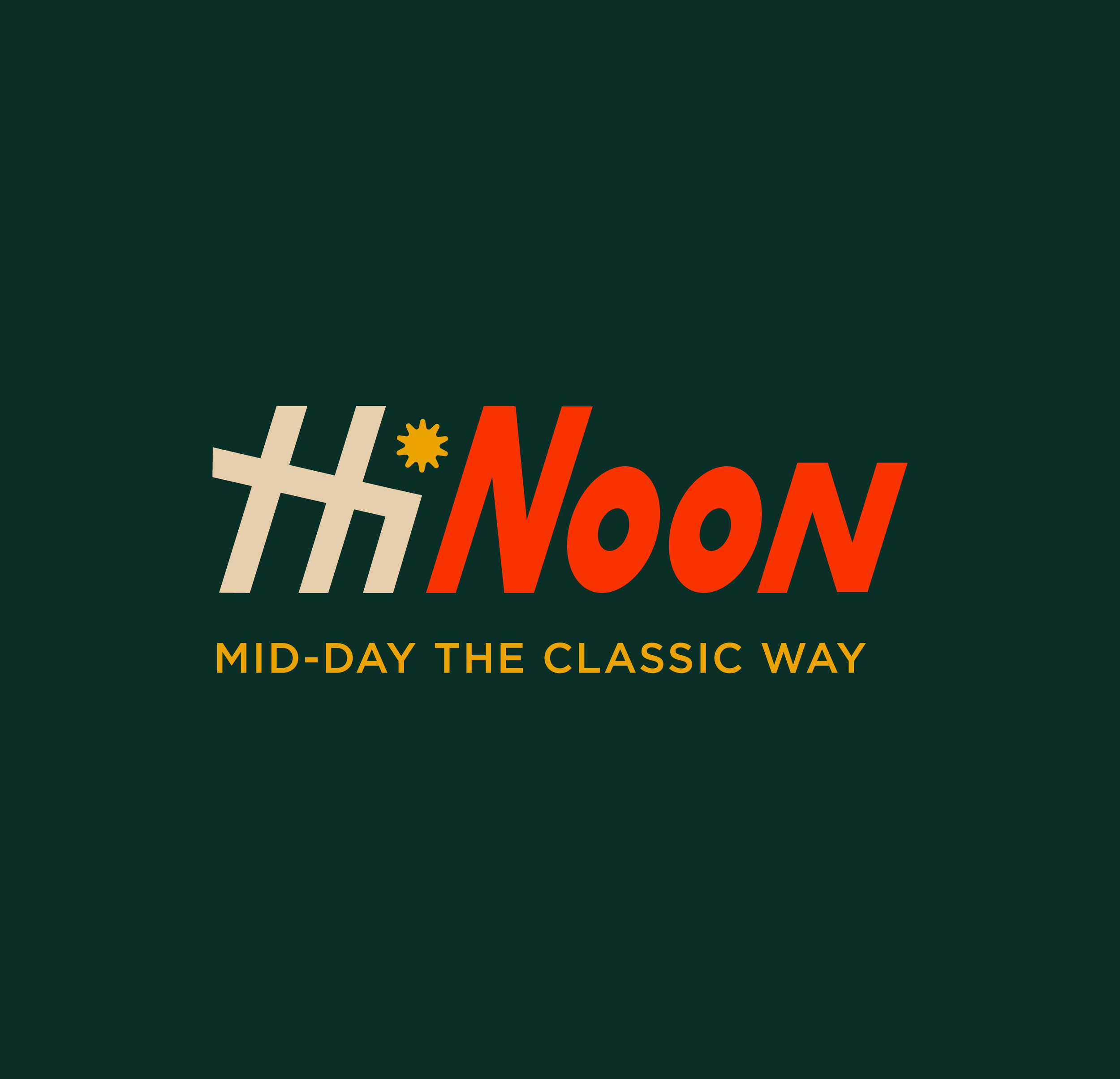
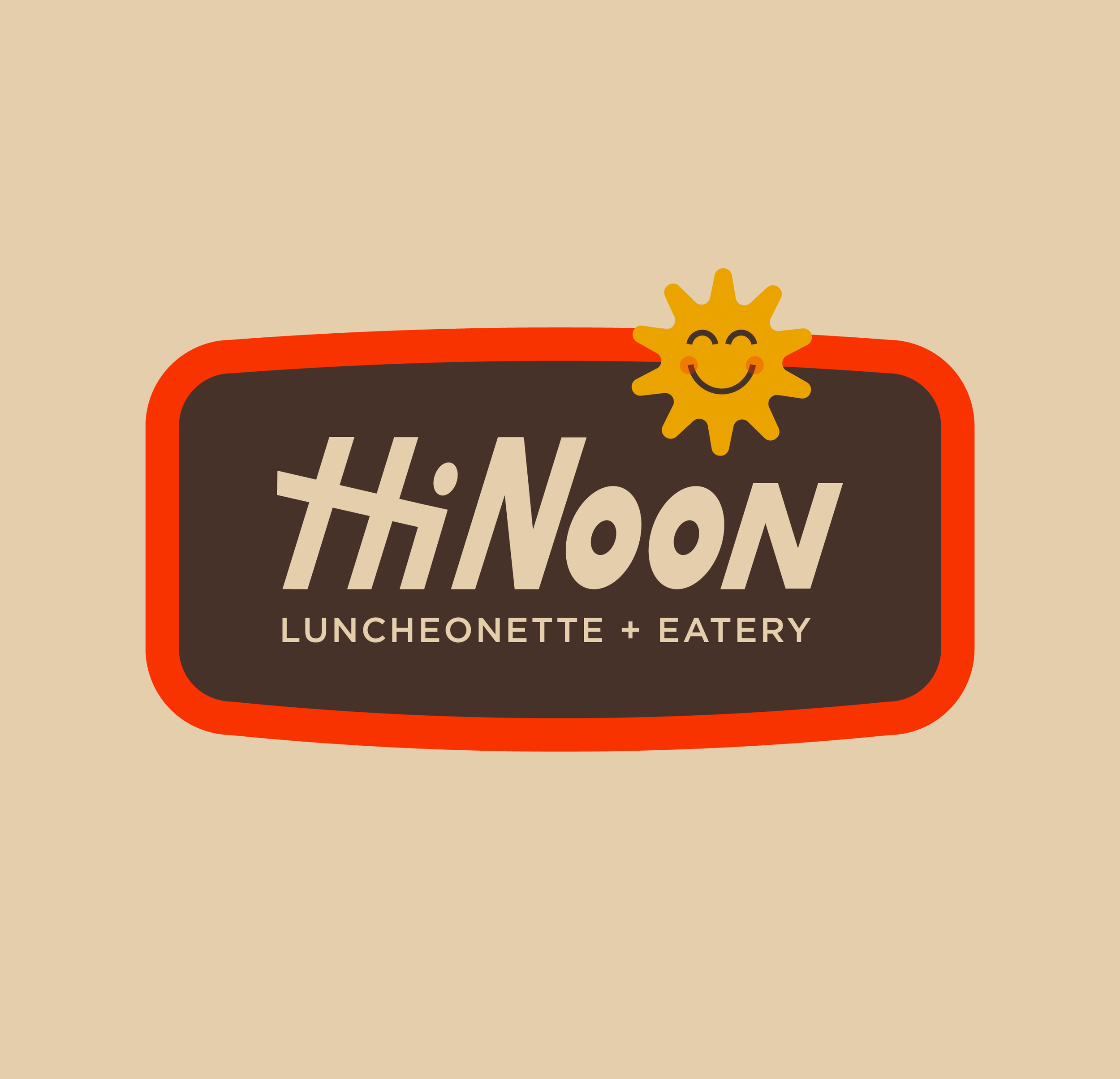
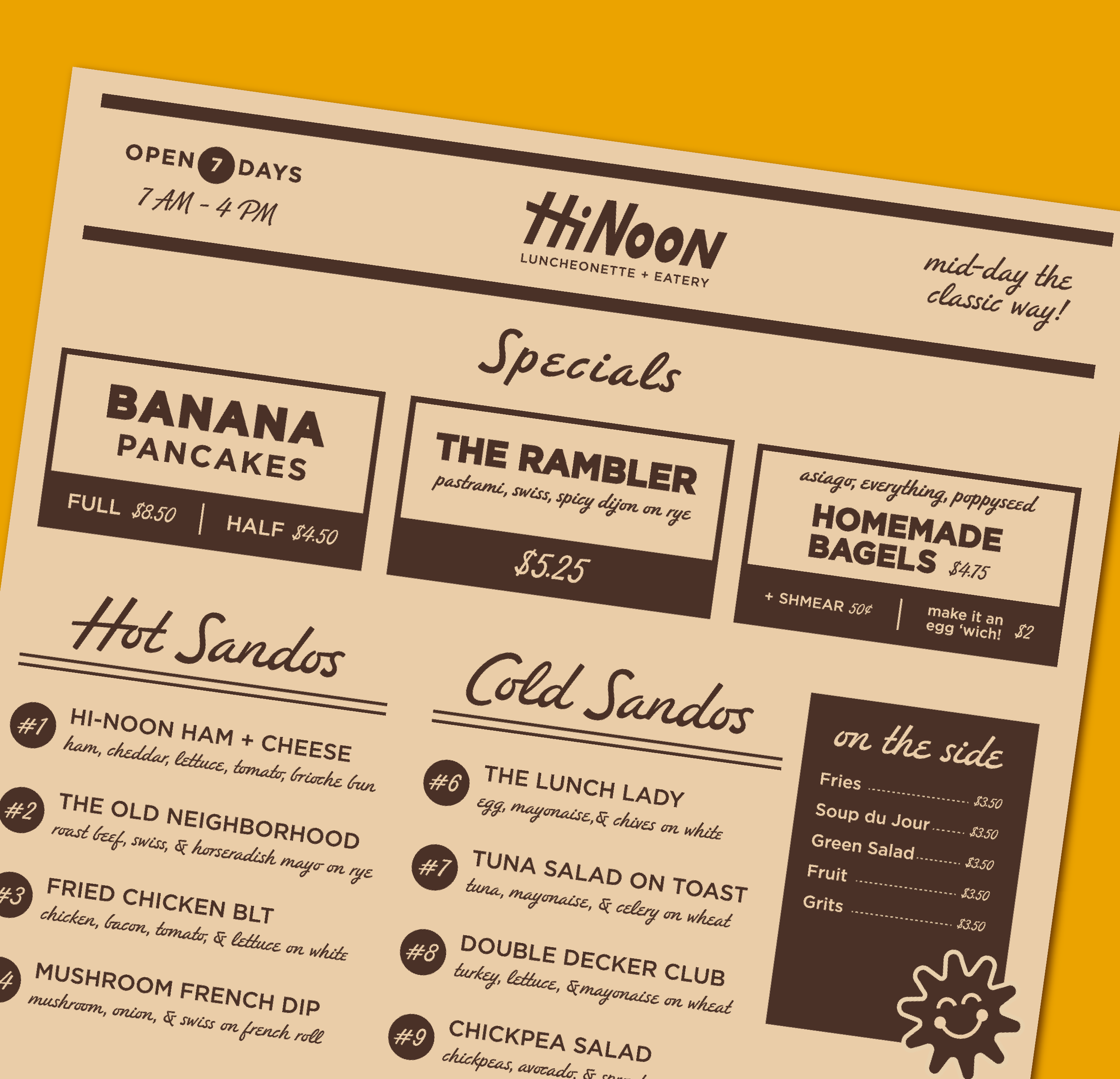
Hi-Noon Luncheonette is a modern take on the classic American diner — nostalgic at heart, but thoughtfully reimagined. It blends mid-century charm with elevated simplicity: counter seating, strong coffee, sunlit windows, and a tight, well-executed menu.
The concept centers on a brand identity that feels both familiar and intentional. It’s a daytime spot built for slow mornings, working lunches, and the kind of regulars who value consistency done well.
HI-NOON LUNCHEONETTE
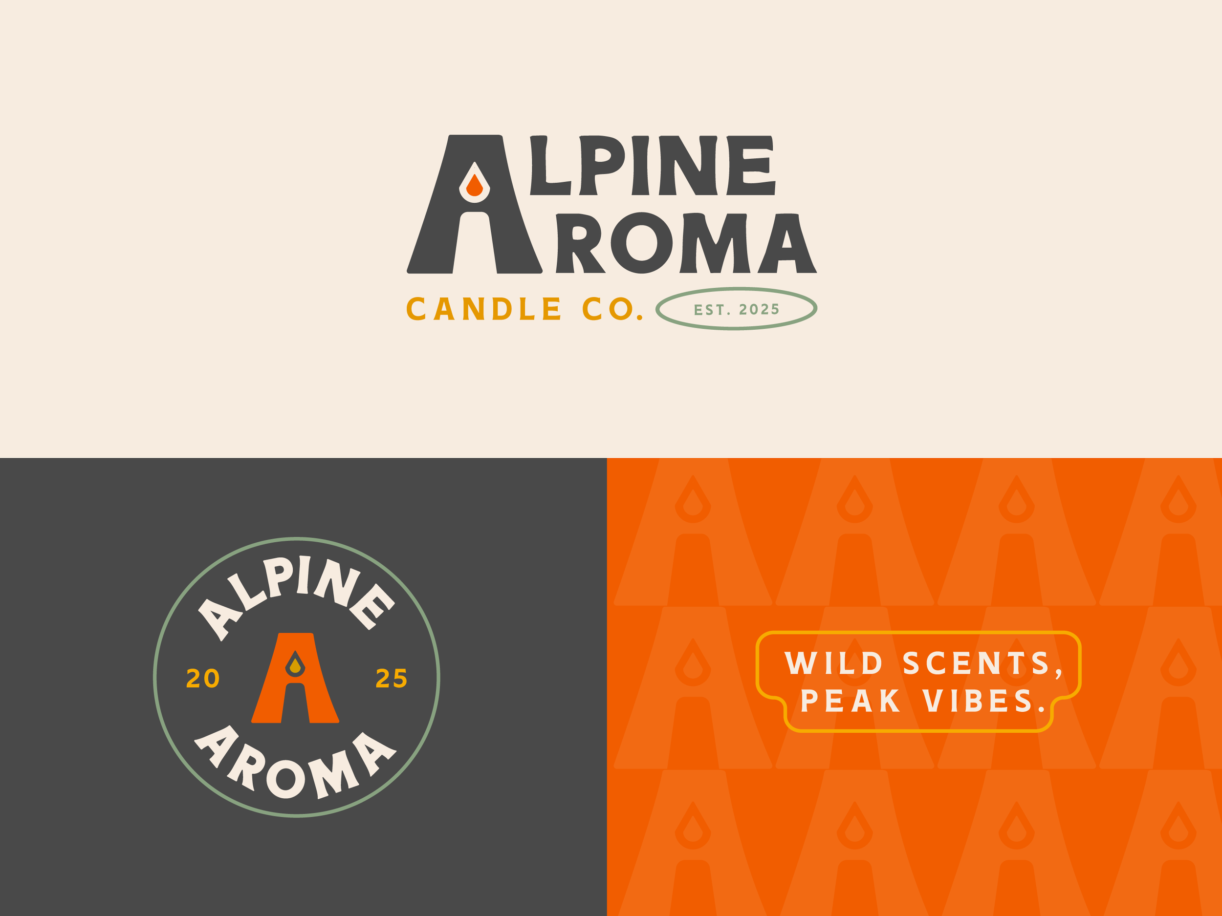
Alpine Aroma is an outdoor-inspired candle company for adventure seekers and nature lovers. Its earthy, down-to-earth aesthetic brings the wilderness home with scents inspired by pine trails, rocky summits, and cozy cabins. The bold, retro typography and natural color palette reflect this spirit, with a hidden candle and flame in the “A” symbolizing warmth and adventure.
ALPINE AROMA CANDLE CO.

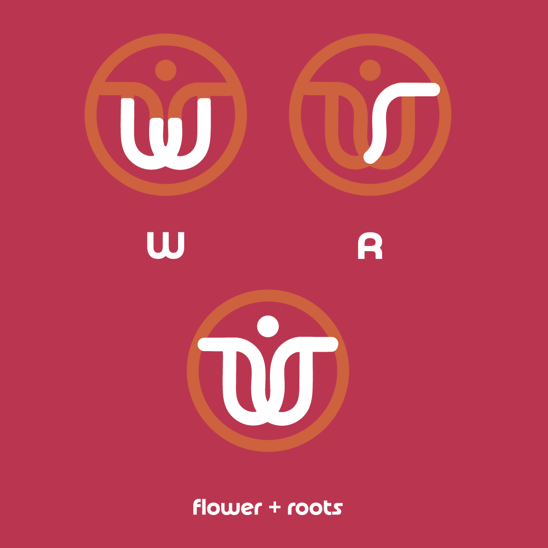
Wild Root Mountain Florals is a concept brand inspired by the raw beauty of nature—organic, untamed florals rooted in the mountains. The identity blends elegance with earthiness, featuring a logo that intertwines a blooming flower and its roots with subtle “W” and “R” letterforms, and a palette inspired by high-altitude landscapes.
WILD ROOT MOUNTAIN FLORALS


The Hole Donut is a concept brand built around a simple, playful idea: every whole doughnut comes with a doughnut hole. I developed this project from the ground up, crafting the name, tagline, logo variations, and full brand identity to bring the concept to life. One branding direction features two quirky mascots—a doughnut and its doughnut hole—designed to make the tagline instantly clear. The look is bright, fun, and kid-friendly, while also tapping into a sense of nostalgia for adults who remember the classic doughnut shops of their childhood.
THE “HOLE” DONUT


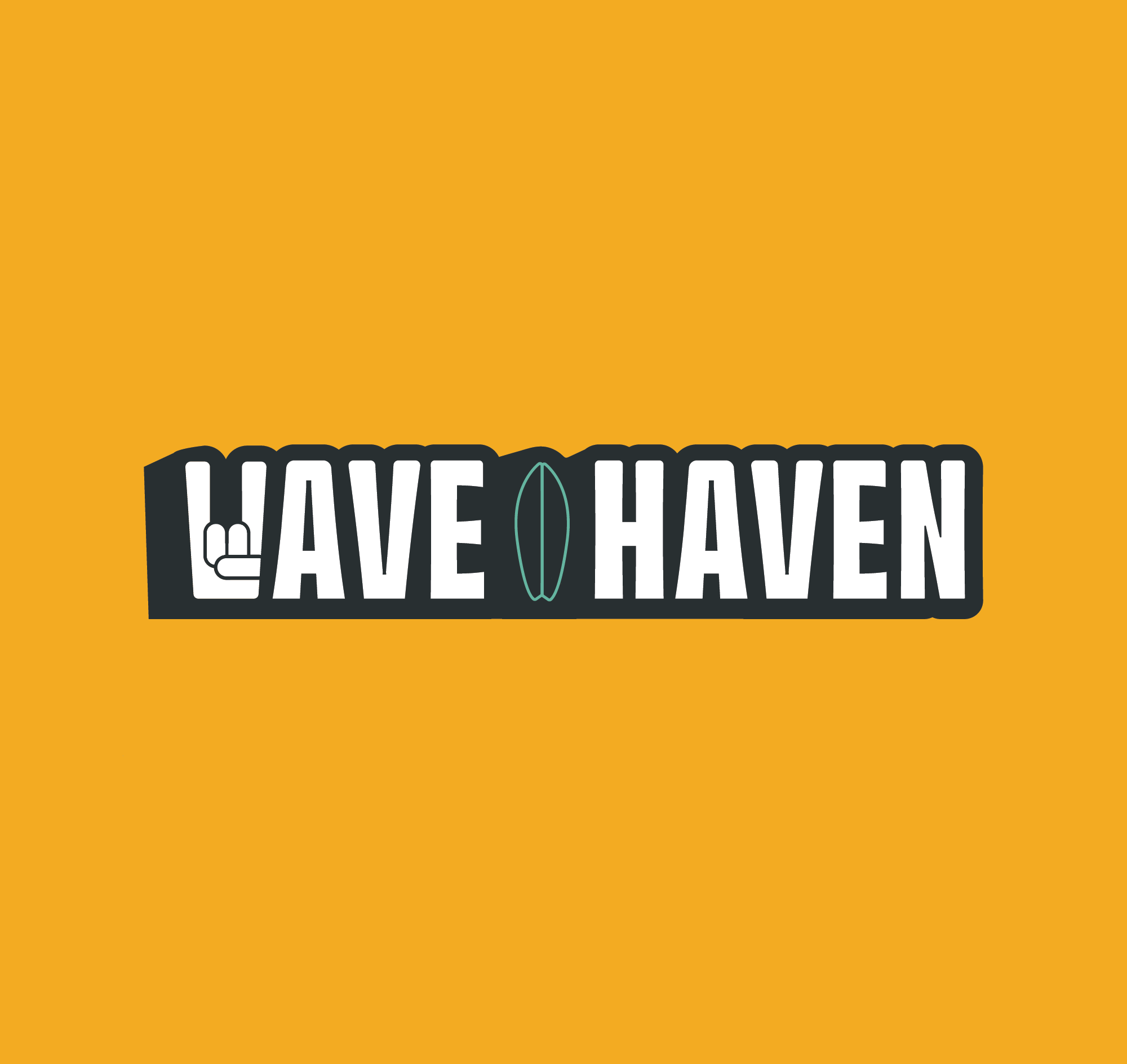
Wave Haven Surf Shop is a concept brand inspired by California surf culture: bold, vibrant, and a little rebellious. The bold, playful typography sets the tone, with a custom “W” incorporating a subtle “rock-on” hand gesture—because great waves deserve a little celebration. With three logo variations, the brand stays cohesive while remaining flexible across different applications, from shop signage to board decals.
WAVE HAVEN SURF SHOP


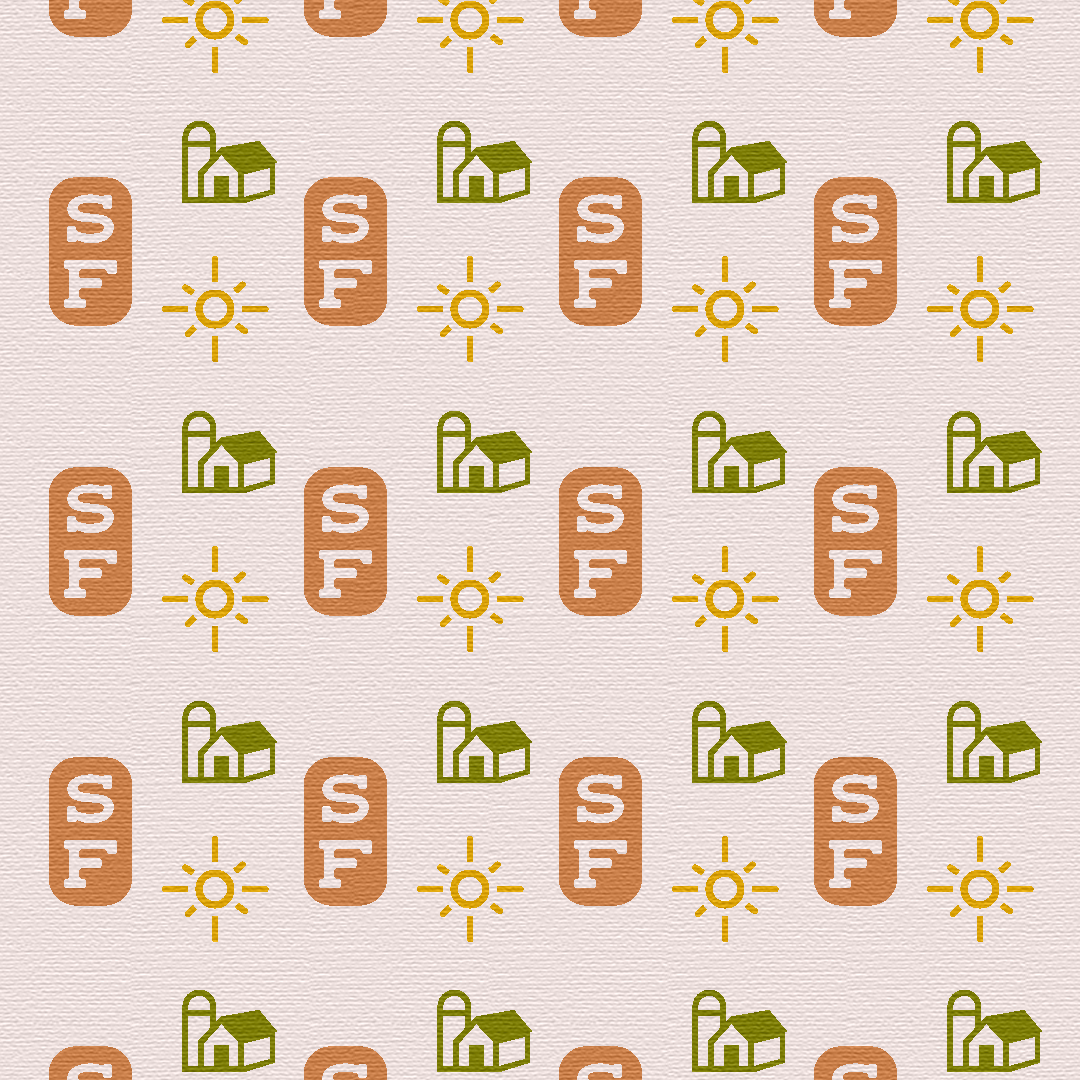
Sunset Farms is a concept brand designed to feel warm, calm, and grounded. Using abstract sun and field imagery and a soft, natural palette, the identity balances simplicity with character—resulting in a modern yet timeless visual story. Sunset Farms isn’t a real business, it represents the kind of thoughtful branding I love to create: fresh, approachable, and rooted in a strong visual story.
SUNSET FARMS


YULETIDE IN THE PINES HOLIDAY FESTIVAL
Yuletide in the Pines is a holiday festival brand concept inspired by Golden, Colorado, blending bold color, retro charm, and local character. The "Howdy Folks" text is a playful nod to Golden’s iconic welcome sign, instantly connecting the event to the town’s history and character. A key piece of the brand identity is the custom pattern, designed to extend beyond the logo and create a recognizable visual language. Whether through color, shape, or texture, this consistency helps people associate the festival with its lively, festive spirit—no matter where they see it. The result? A brand that’s as fun and memorable as the event itself.


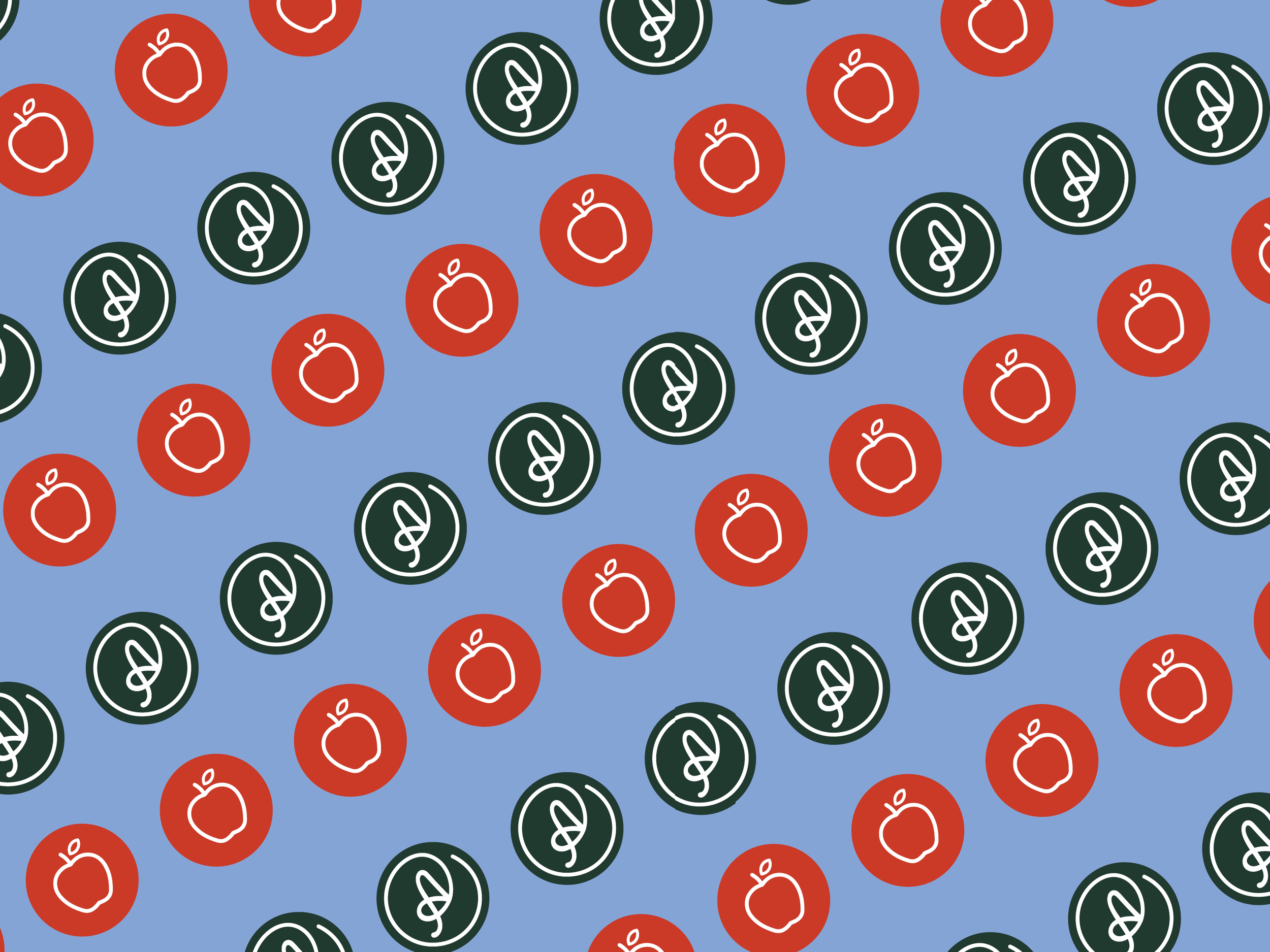
AUTUMN ACRES - FARM, ORCHARD, & CIDERY
Centered around a simple apple-shaped logo and a flowy, cursive font, the design feels inviting, nostalgic, and just a little bit playful—like a crisp fall afternoon spent apple-picking with a cider in hand. The color palette brings the brand to life in a fresh way, combining classic orchard tones of deep red and dark green with an unexpected pop of bright, purple-toned blue. This mix adds a contemporary edge while keeping the warmth and coziness you’d expect from a family-run orchard and cidery.


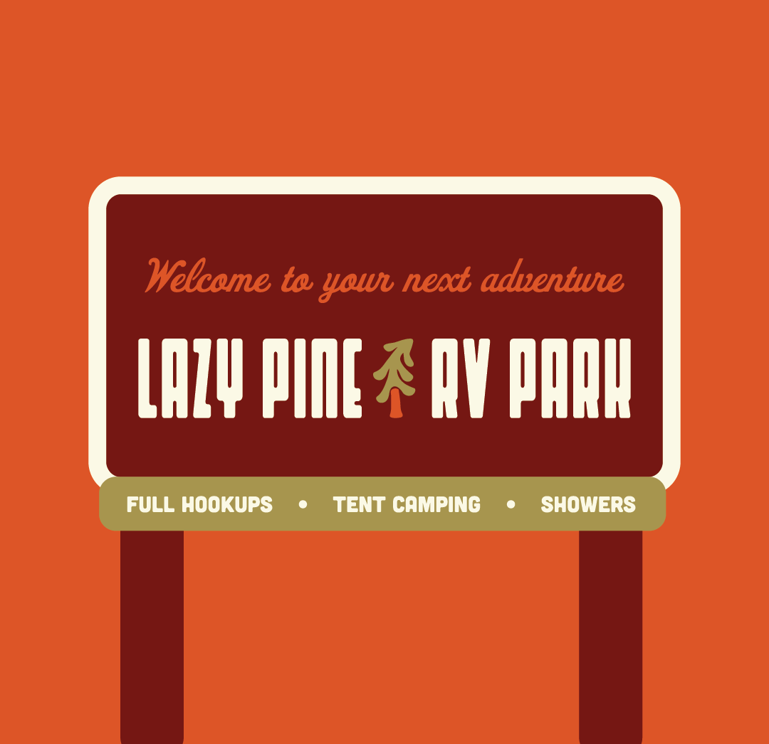
Lazy Pine RV Park is a concept brand inspired by vintage camping nostalgia, blending woodsy charm with playful, retro flair. Earthy tones, bold typography, and illustrated details create a welcoming identity that feels both familiar and fresh for modern travelers.
Whether on signage, merch, or digital promotions, the identity evokes the simplicity of campfire nights, road trip adventures, and the timeless appeal of getting off the grid. This project was all about crafting a brand that feels both familiar and exciting—welcoming RV travelers with a laid-back vibe that makes them want to park, stay awhile, and enjoy the pine-scented air.
LAZY PINE RV PARK


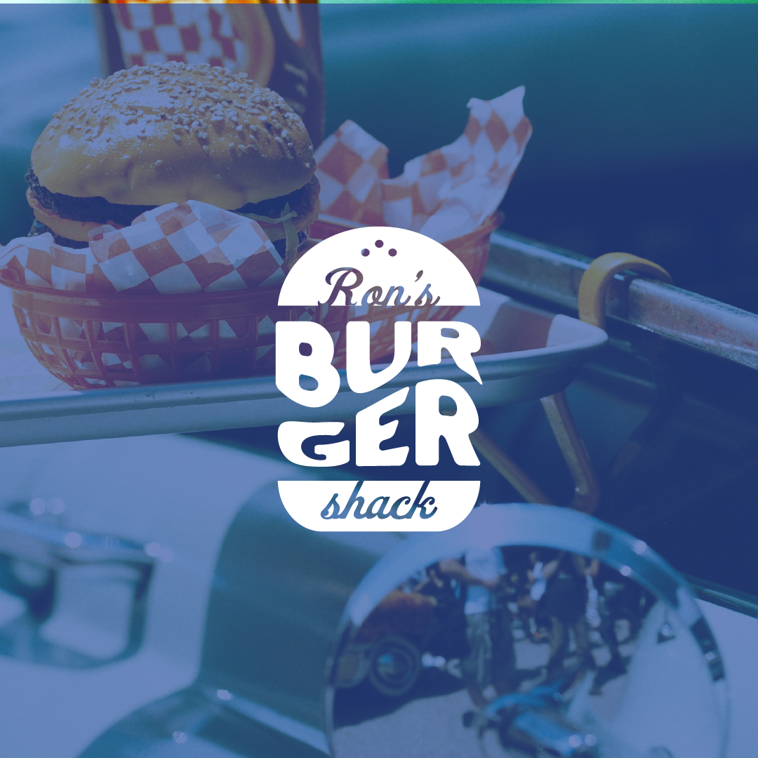
Ron’s Burger Shack is a concept brand that takes you straight back to the golden age of diners—where the burgers are juicy, the fries are crispy, and the cherry pies are served car-side. The retro-inspired identity leans all the way into the classic Americana aesthetic, from the playful, vintage cartoon of Ron himself flashing a peace sign to the red, white, and blue color palette.
The brand is all about personality—fun, familiar, and a little over-the-top in the best way. Whether it’s the checkerboard tabletops or old-school paper food wrappers, every design choice reinforces the feeling of stepping into a time machine (and leaving with a full stomach).
RON’S BURGER SHACK